What is a Contact Form?
If you have ever wanted to get in touch with a business that has a website, chances are you’ve ended up on their “Contact Us” page which probably had their numbers, maybe some social profiles, and a contact form.
While this seems simple enough, there are many businesses that neglect to include a contact form, or include one that is unoptimised for their audience. If you implement it well, you are improving your visitors’ experience and helping your website do what it’s meant to do: improve your bottom line.

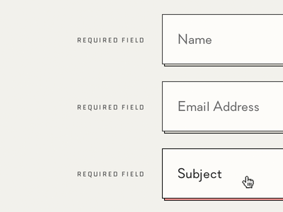
image via Ines Gamler
How can it help you?
Contact forms help you by acting as lead generators (giving you potential customers) as well as giving your site visitors what they are looking for: a quick and easy way to get in touch with you. This marks their user experience on your site as a positive one. Remember, search engines have ways of detecting whether you are offering a positive or negative experience and will take this into account.
Besides helping your customers, it also helps you directly! You are getting the customer or potential customer to give you their contact details, and you can avoid spam mail with a captcha. Additionally, you’re ensuring that you receive the messages submitted via this form and they are not getting caught in your junk filter.
Best Practises
- Avoid long forms! Only think about the details you really need from the customer or potential customer or partner. Do you really need to know their date of birth and profession? The longer the form, the lazier or more suspicious people will feel about having to fill it out. Remember, if you consider a field to be optional, mark it as such (for instance many websites do this with the ‘Telephone’ field because not everyone want to leave their phone number).
- Place your form ‘above the fold’ (so that the visitor does not have to scroll down before he or she sees it). Ideally, you will have a separate “Contact Us” page on your website and the form and your other contact details will be the only content on that page.
- Privacy policy: make sure you guarantee your visitors that the details they leave on the form are safe with you, this is critical to instil trust.
- Don’t use the boring word “submit”, instead use a term such as “click here” or “go” and if you can, make the button colour red or orange. These colours on buttons consistently perform better than others.
- Show a confirmation page immediately after the contact form has been submitted. Many tools and plugins already have this feature built in so you won’t need to do anything technical. Alternatively, set up an auto response that goes out every time someone submits a contact form- as a customer it’s always reassuring to know that the message and details you just sent via a web form have actually been received.
The longer your web form, the lazier or more suspicious people will feel about having to fill it out.
How can you implement it?
- How to add a contact form on WordPress: Luckily for WordPress users, this is the land of the abundant plugins. To add the plugin to your site, go to your WordPress Admin Panel and click on Plugins on the left menu, Add New, and in the search bar enter the plugin you’ve decided to try, for instance ‘Contact Form 7’ or ‘Ninja Forms’. After you download, install and activate the plugin, then you can add a form to your site.
- How to add a contact form on Wix: to add a form on Wix, in their App Market you can choose from a number of contact form apps, such as 123 Form Builder and Epic Forms & Payments. Reviews for each app are available so you know which one fits your needs. Adding is as easy as clicking Add App.
- How to add a contact form on Weebly: Weebly has a very intuitive drag-and-drop online form builder or alternatively, you can use a third party service such as jotform.
- How to add a contact form on Square Online sites: From your Square site’s editor, go to the page you want to add a contact form to. Select Add > Section and click on the Forms option to choose a template. You can edit the form settings from the Square Dashboard > Website > Edit Website > select Contact Us, scroll down to Settings, and select Form Settings.
- How to add a contact form on Squarespace: true to form, Squarespace has a simple and to the point set of instructions here and here. If you have a site with them, then simply Add a new Regular Page and then add a Form Block. Form submissions will be sent to the site owners email address (see how to change that here), Google Drive, or a MailChimp subscriber list. You can customize the form with different form fields, a post-submit message, etc.
Not on any of these platforms? You can use a builder such as EmailMeForm, without having to do anything technical on your site. Make sure your site is mobile responsive. With most of the platforms mentioned above, this will be taken care of for you automatically, but you should double check what the contact form experience looks like from mobile devices. Few things more off-putting to a visitor than a super hard-to-fill-out form!
if your contact form isn’t mobile responsive, you could lose out on over 50% of potential conversions.
Remember, a contact form is an opportunity. It’s not only for people to submit questions: it’s your next client, your next partner, your complaining user converting into an advocate. Simple changes like this one implemented on your website can make a difference.


